Nutanix Learning Academy Mobile Edition.
Pioneering mobile-first product design at Nutanix to promote greater organizational efficiency.
ROLE
UX Design Intern
TIMELINE
June - August 2024
TOOLS
Figma
User Research
SKILLS
Visual Design
Design Systems
User Research
Interaction Design
OVERVIEW
01
MY INTERNSHIP EXPERIENCE
Pioneering the Mobile Experience for Users at Nutanix
Nutanix Learning Academy (NLA) is a learning management system (LMS) for employees, partners, and customers. NLA allows users to complete training, courses, and earn certifications.
This goal of this project is to create a mobile app version of the Nutanix Learning Academy website so that users may complete courses on the go and incorporate the Nutanix rebrand. Doing so will promote organizational efficiency and empower users to advance their knowledge.
PROJECT FOCUS
NLA User Journey Flows
Log-In
Home
Profile
My Training
My Certifications
My Missions
My Channels
Nutanix University ILT
Nutanix Learning Academy encompasses various user journeys, but during my internship, I researched seven of them and concentrated on designing five, given the time constraints.
* Bold indicates the flows I focused on
NLA WEBSITE
Background/Context
NLA is already an existing website, but it is outdated and has many broken features/functions. Below are some images of the current website and how it may look from a Chrome browser on mobile. The responsiveness is not too great and the UI & UX both need an update.
Nutanix recently underwent a company-wide rebrand, and while the implementation of this is still in progress, the initial designs for the new NLA website are being developed, serving as the foundation for the mobile application design shown below.
PHASED APPROACH
Project Plan
I broke the project into 5 stages to make it easier to tackle and stay on top of deliverables. I began with basic research on mobile design guidelines for IOS/Android and then planned the important components that should be included in the mobile version.
RESEARCH & PLANNING
02
Research Methods:
Below are the research methods I employed to develop a strategic plan for this project. These insights guided my decisions on prioritizing features and user journeys for an optimized mobile experience.
-
Purpose: Understand trends, user preferences, and educational technology best practices.
Benefit: Provides foundational knowledge and identifies gaps to inform app design.
-
Purpose: Examine competitors and similar education-focused apps in the market.
Benefit: Identifies strengths, weaknesses, and unique features to implement in the app design.
-
Purpose: Assess usability based on existing NLA website.
Benefit: Detects usability issues early to enhance user experience and ease of use.
-
Purpose: Prioritize features into Must-have, Should-have, Could-have, and Won’t-have categories.
Benefit: Focuses development on essential features first and helps manage project scope effectively.
MoSCoW Analysis Table Results
DESIGN DIRECTION FROM RESEARCH
Key Features for NLA Educational Mobile App
Simple Navbar for Easy access
Navbar positioned for effortless navigation within thumb zone reach.
Informational Homepage
Central hub: Overview of courses, updates, and recommendations at a glance.
Refined Search Experience
Enhanced search: Filters and auto-suggestions for quick and precise content discovery.
Informative Video Playback Screen
Seamless learning: Auto-play and intuitive controls for a smooth video experience.
Bookmark Grouping
Organized bookmarks: Group and manage favorite courses for easy access.
WIREFRAMING
03
ITERATION DRAFTS
The Wireframing Process
The wireframes were developed in multi-draft stages, with a first and second draft. Below is a glimpse into the Figma file which is organized by sections representing various user journey flows. To facilitate testing various ideas, the wireframes were intentionally left unconnected.
First Draft
Second Draft
*Take a tour of my figma file below! ⤵
PROTOTYPING
04
DESIGN DECISIONS
Final Prototype & Important Design Decisions
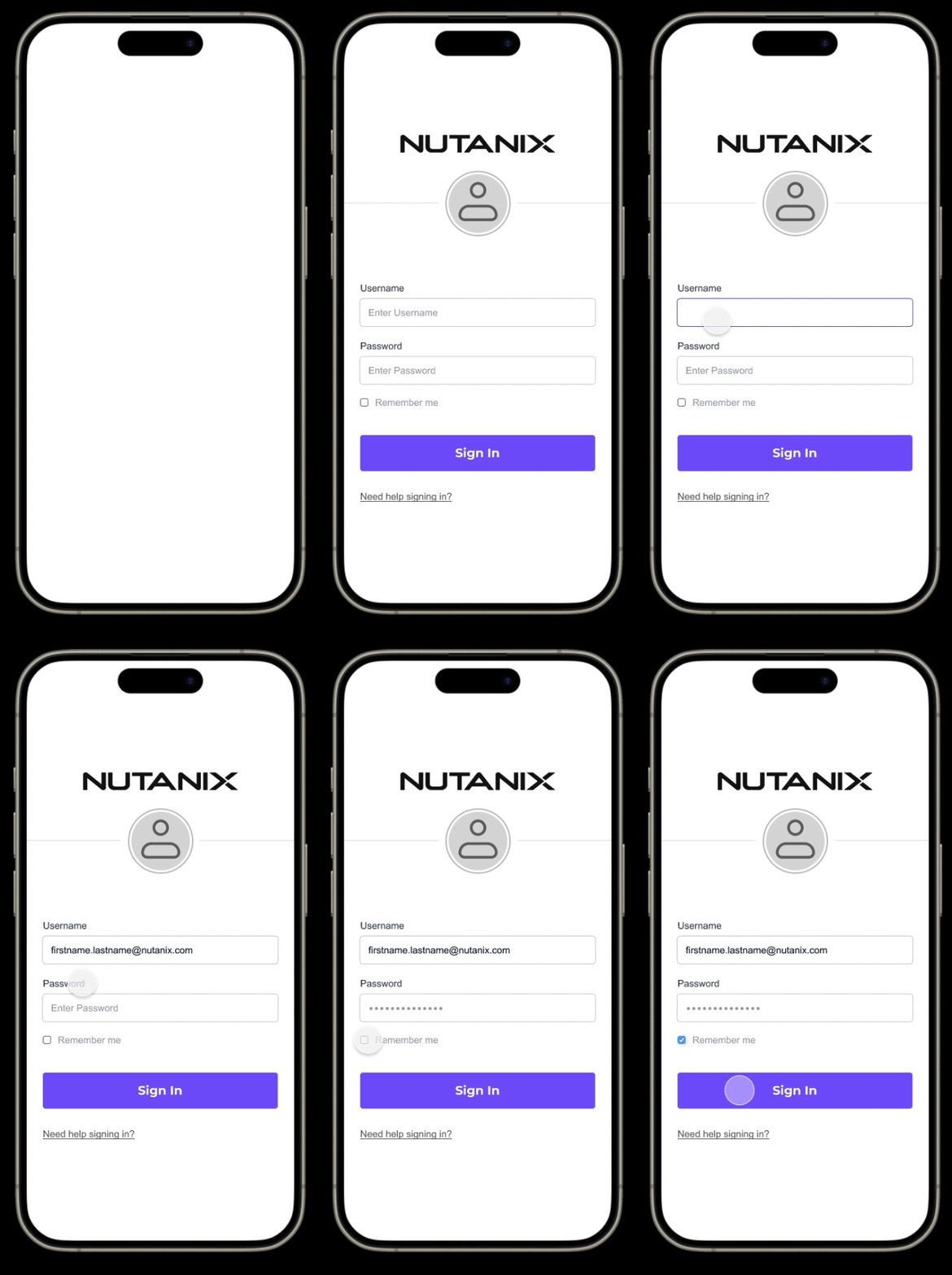
Log-In
Design Decisions:
Immediate Okta login prompt
Quick logo loading screen to show off branding
No complex onboarding/onboarding screens as most users of the app will be familiar with the purpose of NLA
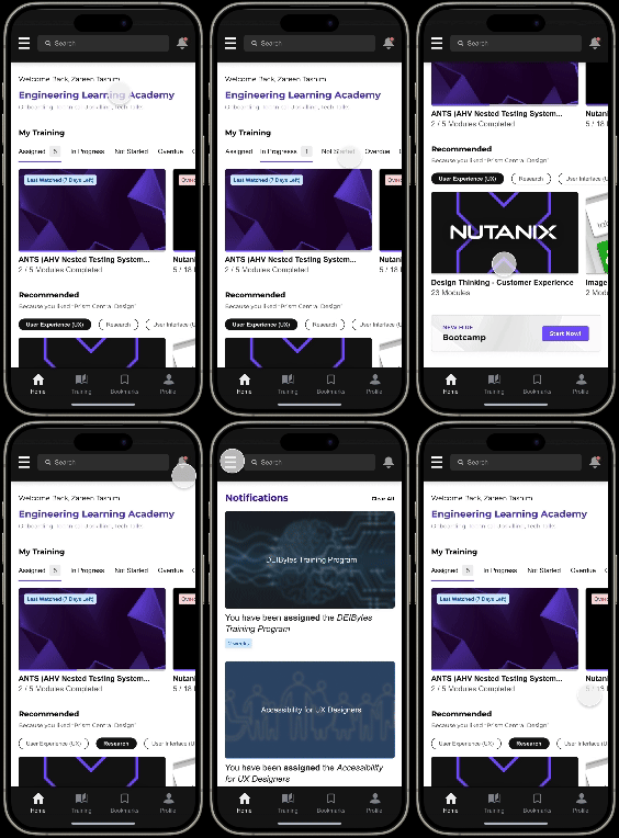
Home
Design Decisions:
Based on research it was discovered that a lot of people usually access their assigned courses through notifications
Thus on the mobile app, the notifications icon is placed on the top nav bar.
Training is high priority so it’s placed at the top for quick access
Tablist menus for My Training videos for quick toggle between categories
A recommended section is created to encourage users to continue learning
The logo appears in the hamburger menu
Profile
Design Decisions:
Overall training completion stats with values (website does not show values unless clicked on)
Information is broken into chunks to share stats, role information, and certifications to simplify the consumption of information
Earned certifications can be viewed and shared from the profile page
Trainings
Design Decisions:
Assigned courses are shown priority-wise since most users have the goal of completing what they have to do
There are tags for due dates on trainings
Training can be accessed from multiple routes: the home page, trainings page, and notifications
Tablist option on the trainings with Overview, Transcript, and Up Next provide users with lots of information in a less overwhelming way
Bookmarks allow users to create groups of courses for later access
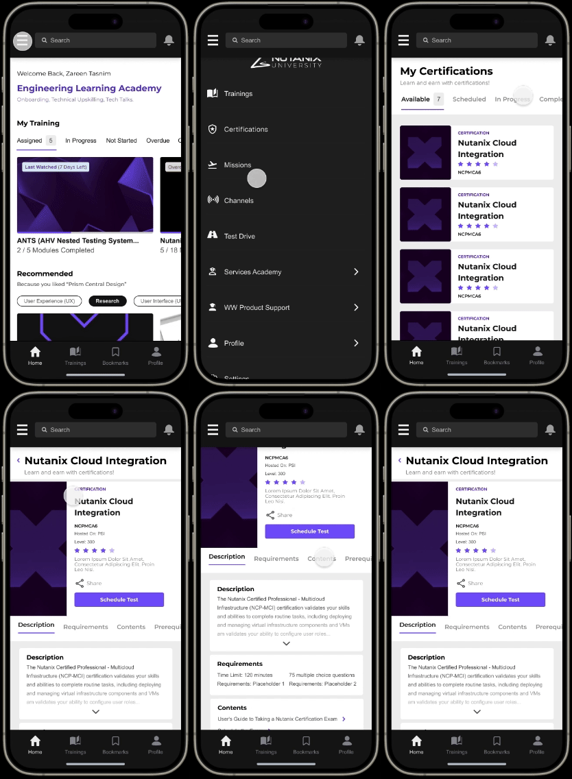
Certifications
Design Decisions:
Certifications can be accessed from the hamburger menu
Most users will not be using NLA to check certifications constantly so it is placed in hamburger menu vs the bottom navbar
Quick view of certifications shown and once clicked on will expand into a detailed view
The names of the certifications are shown clearly which was something that was hard to identify on the website
Final Figma Prototype
TESTING
05
USER TESTING
Use Cases
Let’s take a look at three use cases to determine what a user might be using the NLA mobile app for.
“I am an employee who has a long commute to the office so I want to be productive during that time by watching my assigned trainings on the go.”
E-Learning and training status should sync automatically across all devices including features like bookmarks
“I am a new employee who want to learn more about accessibility so I want to browse for trainings on this topic.”
Enhancing User Experience through Advanced and Comprehensive Content Search Capabilities
“I know I completed a certification in the past and I want to access it so that I can share it with others.”
Enable Users to Seamlessly Access and Share Their Certifications Through Their Account
CONCLUSION
06
Project Takeaways
OUTCOMES
Increased Retention and Training Completion Rates
Improving user experience for NLA mobile version will lead to higher training completion rates and increased long-term engagement for hundreds of employees.
A Mobile-First Product Approach Promotes Efficiency
Mobile products help organizations stay relevant and efficient. Mobile enablement improves workflow efficiency and removes bottlenecks and other constraints.
Implementing adaptive learning features that adjust based on user engagement helps customize educational content to meet individual needs, thereby enhancing overall learning outcomes.
Adaptive Learning Features
INTERNSHIP TAKEAWAYS
What did I learn?
-
Conducted user research and usability testing to ensure an optimal mobile experience.
-
Managed timelines, resources, and stakeholder communications to keep the project on track and meet deadlines.
-
Applied best practices in mobile design to create a responsive and engaging user interface.
-
Worked closely with developers, product managers, and designers to integrate feedback and iterate on designs effectively.
GRATITUDE
Final Remarks
“Design is my true calling, and I can confidently say it's a career path that not only excites me but also aligns perfectly with my passions and strengths. It's a journey I look forward to embracing for years to come.”


